
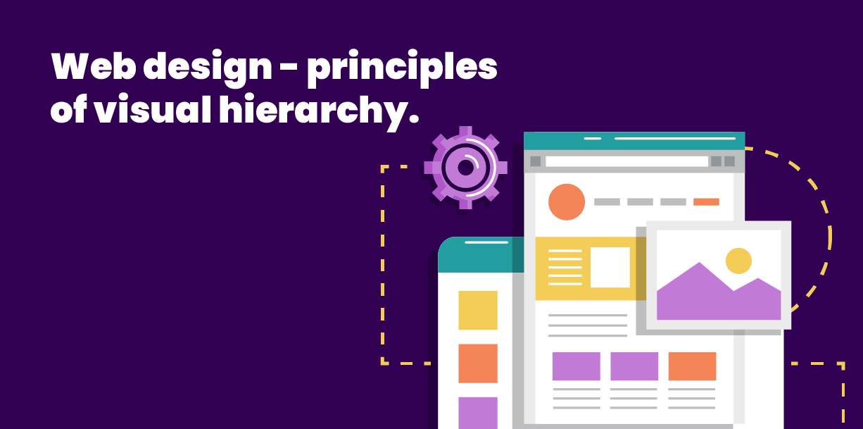
What’s visual hierarchy and why does it matter?
One of the most crucial considerations for web designers is visual hierarchy. Simple put, this is the order and size of the elements to appear on any given page. The reason for this is simple – the thing that is the biggest draw to the site must be featured first. That means making sure that the hierarchy of visual elements on a page is always set out so the biggest messages come to the top and are seen first.
Sounds simple, right? Well, it is, but there are some key principles that need to be taken into account in order to achieve best practice visual hierarchy. Here are some of them:
Composition
All content on the site – whether written or designed – should flow well with information being drip-fed to the reader in a sensible order that’s easy to digest and understand. So the first consideration is where the reader’s eye will (or should) fall first on any webpage. And then, the next question is which elements will help to guide them through to the next thing you want them to look at? It all ties very closely in with user experience, and composition comes into play by using the ‘rule of thirds’ and reading patterns (most commonly left to right), in a ‘Z’ down the page.
Typography
The words on your site are subject to their own visual hierarchy. So, the big messages – aka the headlines – should always be in the biggest, boldest font. And then the subheadings should be a little smaller than that, and the small print/detail in the smallest font (but still large enough to read comfortably on any device). This helps the reader subconsciously focus on the biggest messages first, helping them with their journey through the site. Whether design or typography, the target is to always make the content as digestible as possible.
Colour and contrast
Colour and contrast are vital considerations for any website. Too bland, and it all becomes a bit… meh. But if it’s too vibrant and colourful then you’ll put visitors off pretty quickly. The answer is in a sensible, eye-catching colour scheme that you stick to without fail, always choosing colours that complement each other perfectly. You should aim for one bright colour that you can use when you want to give something a little more ‘oomph’, and then a variety of more subtle colours that can be applied across the site and that work well with each other.
Of course, there is a tremendous amount more to web design visual hierarchy, but those are some of the basic principles that we use to inform our work. At Studiovine we create beautiful websites that have exceptional user experience, and much of this is down to the visual hierarchy techniques that we apply. Get in touch today to find out how we could help you create the perfect website for your business.